Learning goal
We are learning to:
- Collect, organize, represent, and make inferences from data using graphs, and describe related applications
Success criteria
I am able to:
- Read and interpret graphs obtained from various sources
- Represent categorical data by constructing graphs using a spreadsheet
- Make inferences based on the graphical representation of data and justify conclusions in writing using convincing arguments
Take a guess!
This might sound like a strange first direction for a math course, but let’s see where it leads.
You can count the jelly beans you see and take a guess about how many might be hidden. One way to be sure is to count all of the jelly beans. You may have thought of other ways.
Did you guess 3 (1-6, 2-5, 3-4)? Did you guess 6 (1-6, 6-1, 2-5, 5-2, 3-4, 4-3)? Did you have another guess?
Think
How might you estimate your monthly income, when your income changes every month?
| Your Monthly Income | |
|---|---|
| Month | Income |
| April | $800 |
| May | $1,105 |
| June | $900 |
| July | $1,000 |
When you don’t know all the information, you sometimes have to rely on estimates based on what you do know. Continue in this learning activity to learn how to make better estimates using graphs.
Estimation
Estimates can be used to get an approximate (or close) value without having to use a calculator. For example, if your hourly wage is $11.07 and you want to know how much you’ll earn if you work 10 hours, you can estimate the answer. The amount $11.07 is very close to $11.00. To find the approximate amount you would earn, multiply $11.00 by 10 hours:
If you work 10 hours at $11.07 per hour, you’d earn about $110.00.
Estimates are often used by businesses. If you’re going to have the windows replaced in your house, you want an idea of what it will cost before the work begins. The window company will look at the number and type of windows that need to be replaced. They’ll estimate how much time it will take to do the work and then give you an estimate of the total cost. The final bill won’t be exactly the same as the estimate, but it should be close.
Estimates are also used for reading graphs.
Estimation Using a Graph
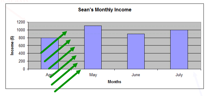
Graphs are designed to display trends and to give a general picture of a situation. They are not intended to give exact information. To read both column and line graphs you’ll need to learn how to estimate. When you read a graph, you get an approximate value. To get the exact value, you need to read the original data. The following scenario will help you learn to estimate using a graph.
Sean's income
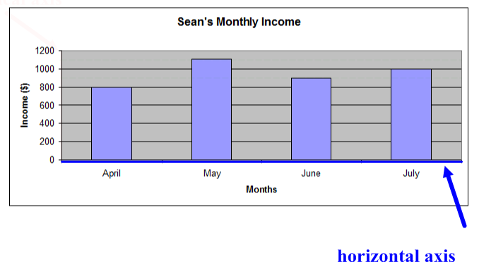
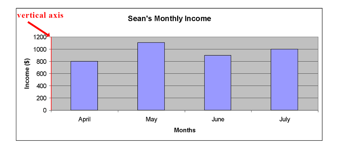
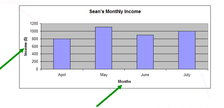
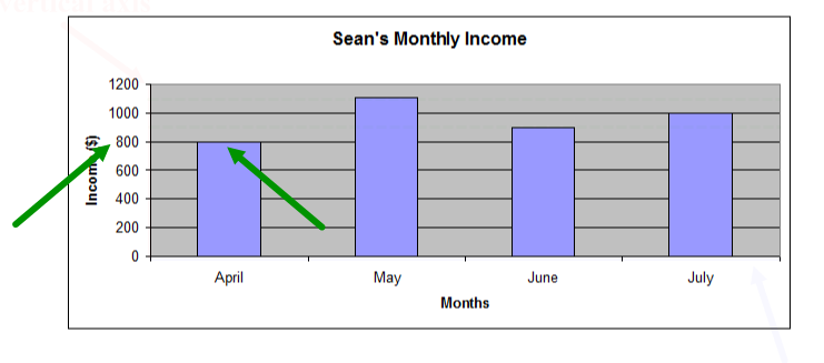
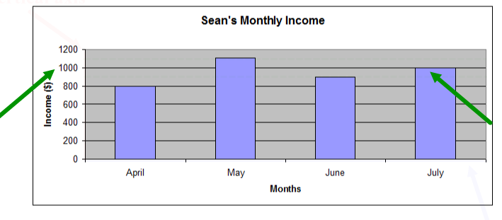
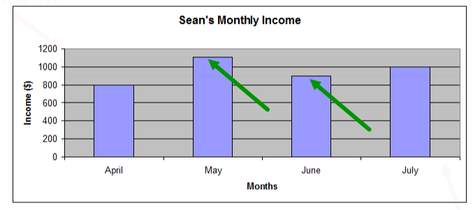
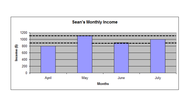
Sean has been working for four months. He doesn’t work the same number of hours each month, so his monthly income changes. Sean recorded his monthly income for each month in a table. He created a graph to compare the income for each month to help him make a monthly budget.
Look at the following table and graph:
| Sean’s Monthly Income | |
|---|---|
| Month | Income |
| April | $800 |
| May | $1,105 |
| June | $900 |
| July | $1,000 |
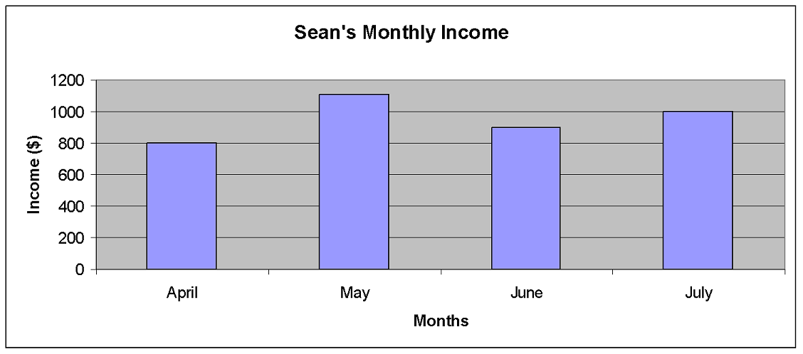
Select the tabs to review how to read a graph.
Try It!
Your turn:
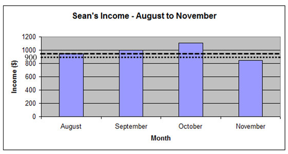
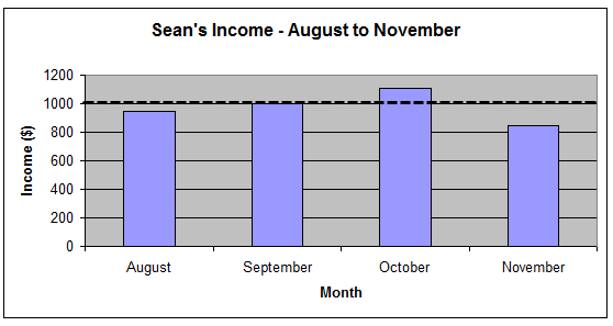
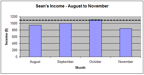
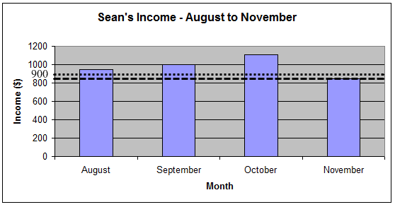
Here is the graph of Sean’s income for the next four months.
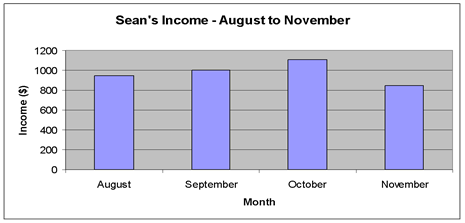
Estimate his income for each of the four months. The actual amounts are available for viewing once you enter the estimation.
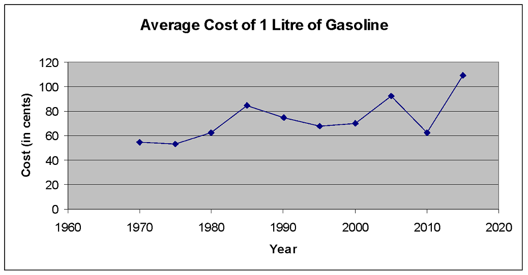
Graphs can be very helpful. They can show you the direction and speed of a trend or provide a big picture of a complex situation, such as how quickly the price of a litre of gas is increasing or how your total expenses are being distributed among the different categories such as rent, food, and so on.
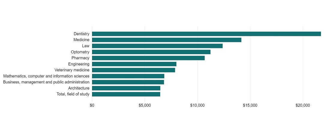
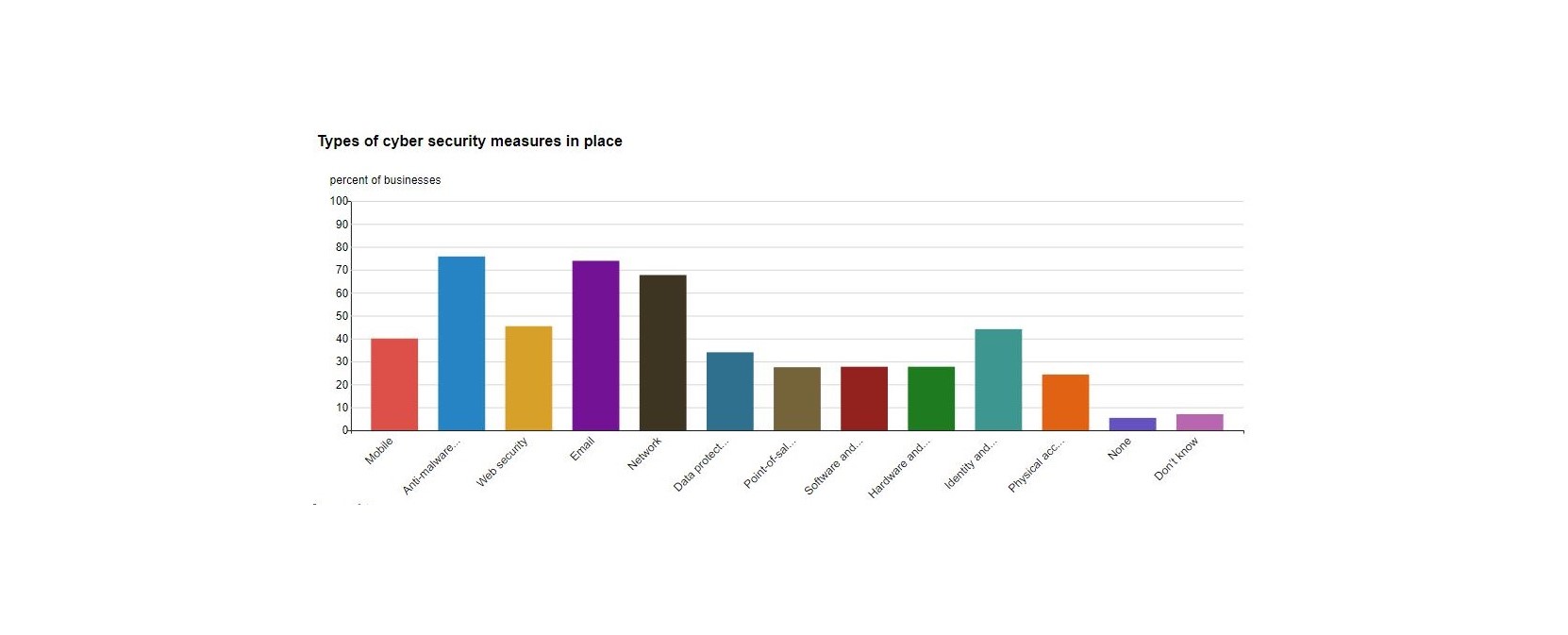
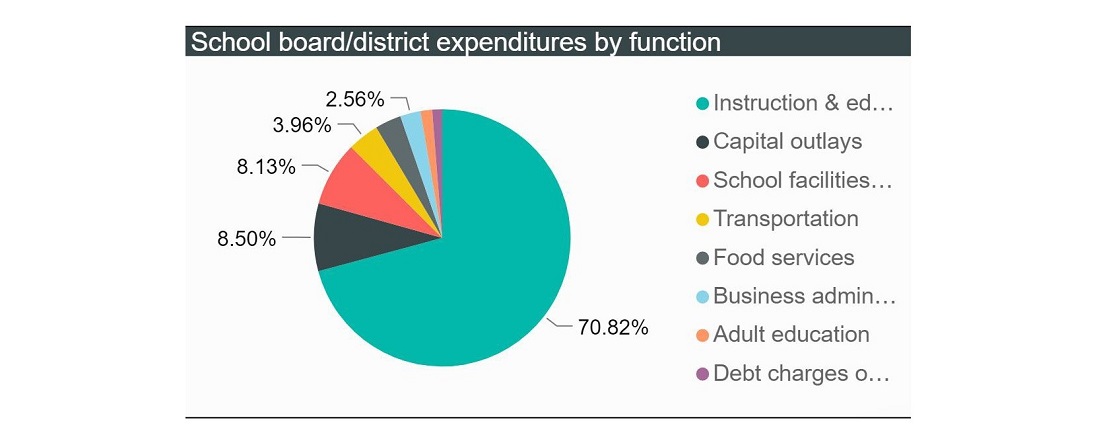
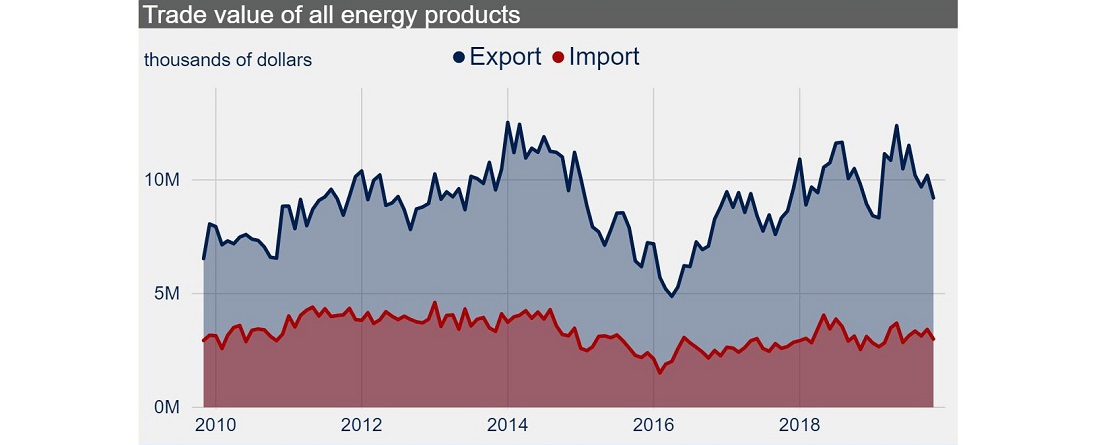
Scroll through the examples of graphs provided and think about what information is being communicated in each one.
In this activity, you’ll learn to read, interpret, and create column (or bar) graphs, circle (or pie) graphs, and line graphs so that you can better understand the information or data displayed in the graph.
If you look at the business and sports sections of a news website or newspaper, you’ll see examples of tables and graphs. There are many different types of graphs commonly used.
Types of graphs
Data can be displayed on different types of graphs. Each type of graph is used for a specific purpose. First let’s look at the different types and then we can discuss which graph to use for which type of data.

Which graph to use?
When you need to decide what type of graph will best display the data, consider the following:
A well-made graph can be very handy when you need to inform someone about or convince someone of the facts. There will be times when you, or your employer, need to communicate data quickly and persuasively with a graph. Have you ever wondered how professional-looking graphs are created? Now it’s time for you to learn how to create your own.
Constructing graphs using technology
Graphs can be made with several different software programs. You’ll be using Microsoft Excel or a comparable spreadsheet program in this course. Please note that the examples in this course use a dated version of Microsoft Excel. Most of the spreadsheet programs have similar features, so once you’ve learned one program you should be able to adapt to other programs.
The first step is to collect your data. You need to have the data organized in a table before you can create the graph. The table must be organized into one or two columns of numbers. The data can then be entered in a spreadsheet to create the graph.

Creating circle graphs
In the examples that follow, you’ll learn how to create a circle graph, a column graph, a line graph, and a special kind of line graph that is referred to as an XY (Scatter) graph in the Excel program. A line graph and XY (Scatter) graph look almost the same. Whether you should choose the line graph or the XY (Scatter) graph will depend on the situation:
- Use a line graph if the data in the first column of the table are words and you have only one column of numbers. This is called one-variable data.
- Use an XY (Scatter) graph if the data contains two columns of numbers. This is called two-variable data.
Before creating the graph, you need to think about which type of graph best displays the particular set of data that you are working with. In the examples that follow, you’ll consider which is the best type of graph and then learn to use Excel to create the graph.
Example
The following table shows the results of a survey about music. People were asked to indicate which type of music they preferred. You want to create a circle graph to show what portion of the total each type of music represents.
| Music Survey | |
|---|---|
| Type of music | Frequency |
| Hip Hop | 20 |
| Metal | 70 |
| Rap | 50 |
| Pop | 100 |
| Alternative | 120 |
| Other | 60 |
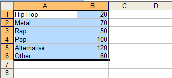
Open the program Microsoft Excel. Enter the data into the spreadsheet. You do not need to include the headings at this time. It is much easier and less confusing to enter these later.
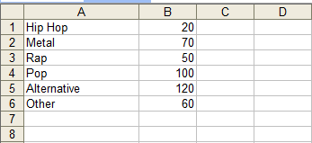
Select the data by clicking and dragging the mouse so that the cells containing the data are highlighted.
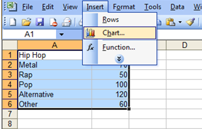
From the toolbar at the top, select Insert and chart.
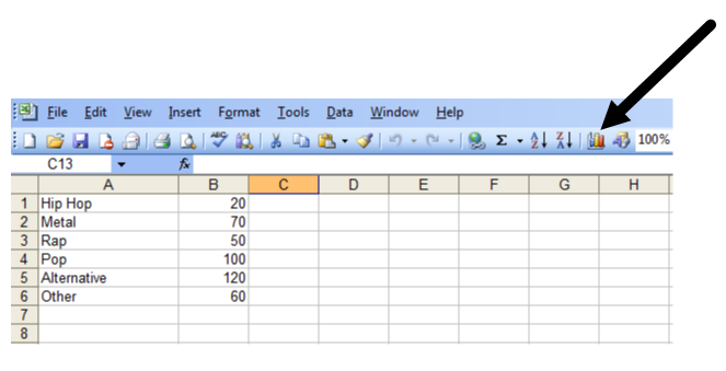
You can also click on the chart icon on the toolbar.
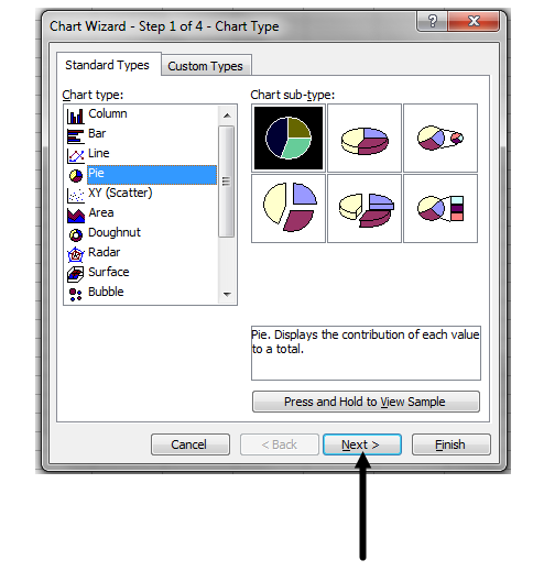
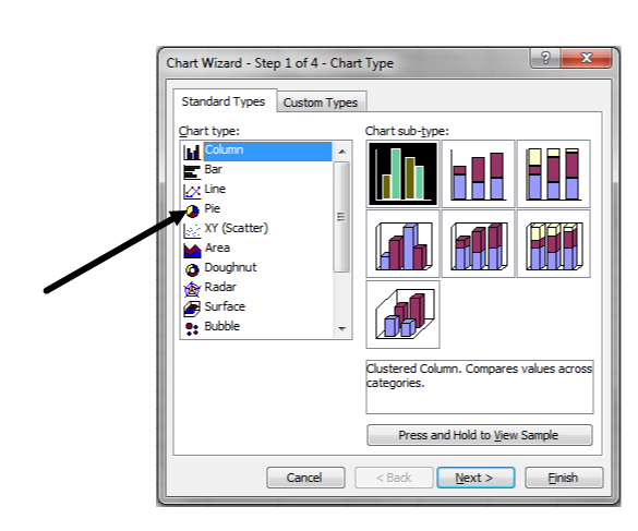
Select Pie since you want to create a circle graph. Select the one in the upper left hand corner.
There are two tabs that say Data Range and Series. The default settings are fine for most purposes so click next.
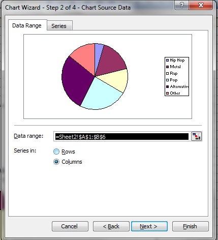
You’ll see a toolbar with titles, legend and data labels. These selections allow you to customize your graph.
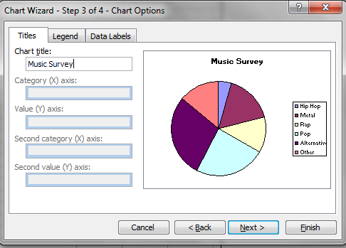
Select titles and enter Music Survey.
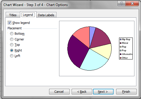
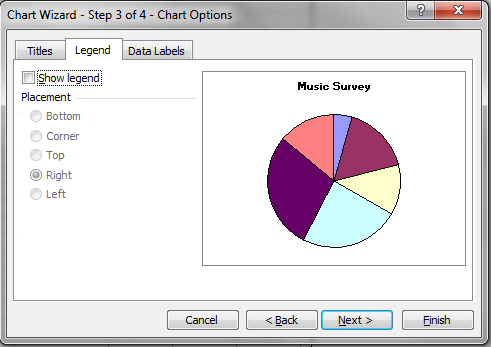
Select legend and de-select show legend. This removes the key that shows the categories on the page with the graph. You may want to include it on your pie graphs if you print them in colour.
Click data labels and select category name and percentage.
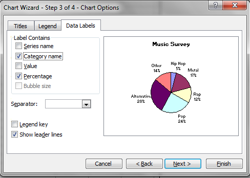
Click next and finish.
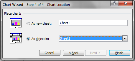
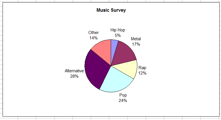
You can make the graph bigger by clicking on a corner and dragging it out. You can copy and paste the graph into a word document or print the graph once you have completed it.
Creating column graphs
A column graph is used to compare things. For example, you could use a column graph to compare the number of goals that were scored in a season by some of the players in the National Hockey League or to compare the number of people that preferred certain movies in a survey.
Example
The following table shows the results of a survey on the favourite hockey team of people in Toronto. You want to create a column graph to compare the popularity of the teams.
| Toronto Survey of Hockey Teams | |
|---|---|
| Team | Number of people |
| Calgary | 100 |
| Edmonton | 120 |
| Montreal | 400 |
| Ottawa | 50 |
| Toronto | 600 |
| Vancouver | 100 |
Open the program Microsoft Excel. Enter the data into the cells. Remember you don’t need to enter the titles.
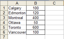
Select the data in the cells.
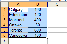
Open the chart wizard by selecting insert, then chart or by clicking the chart icon on the toolbar. Since you want to compare the popularity of the teams, select column.
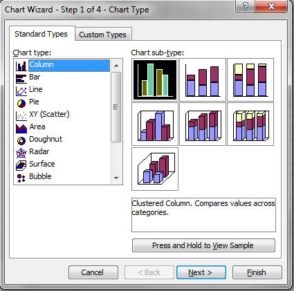
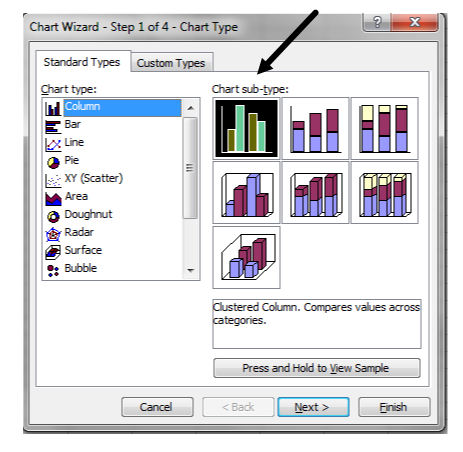
There are different types of graphs available. Choose the default graph in the upper left-hand corner. Click next.
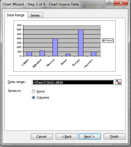
You’ll see tabs labelled data range and series. The default settings are fine. Click next. Select titles.
Under chart title enter Toronto Survey of Hockey Teams.
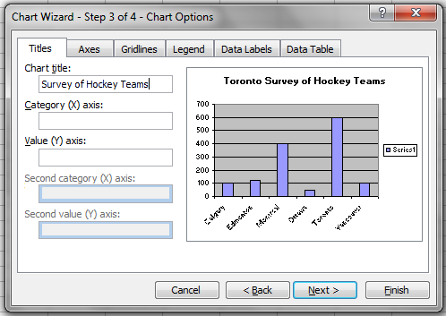
Under category (X) title enter Team.
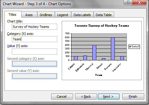
Under Value (Y) title, enter Number of People.
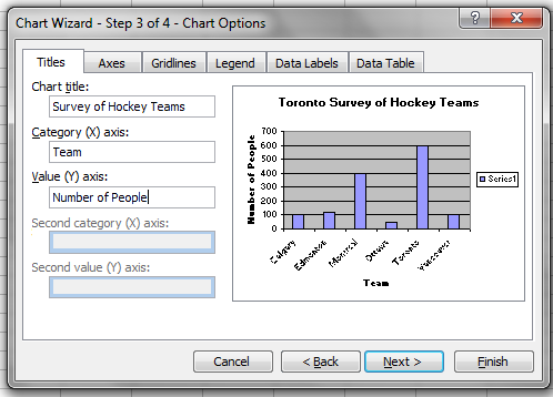
Select the legend tab and de-select show legend.
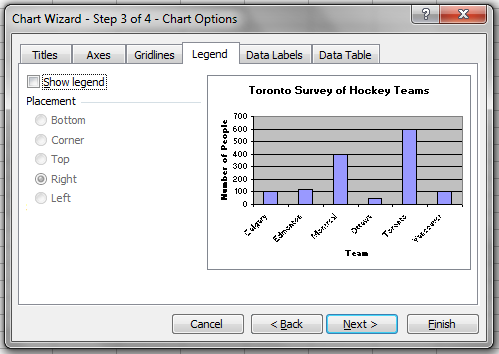
Select next and then finish.
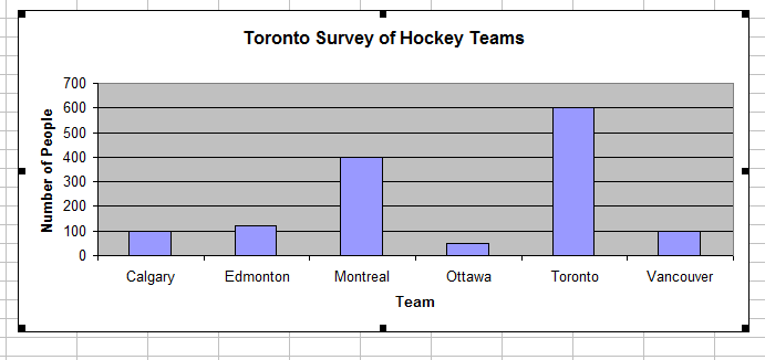
You can copy and past the graph into a word document or print the graph.
Creating line graphs
As you may recall, a line graph is most frequently used to illustrate how something is changing over time.
This particular example will walk you through the creation of a line graph. Let’s get started.
Example
The following table shows the average monthly temperature for a town in Ontario. You want to create a line graph to show the temperature changes as the year progresses.
| Town in Ontario | |
|---|---|
| Month | Average temperature (°C) |
| January | –10 |
| February | –5 |
| March | 0 |
| April | 10 |
| May | 15 |
| June | 22 |
| July | 25 |
| August | 25 |
| September | 17 |
| October | 12 |
| November | 8 |
| December | –4 |
Open Microsoft Excel. Enter the data into the cells. You can use the first letter of each month instead of entering the entire month name.
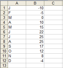
Select the data. Open the chart wizard by using the insert tab or the icon on the toolbar.
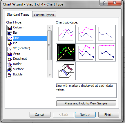
A line graph should be used to display this data since you want to see the temperature change as the year progresses and the data in the first column are words. Select line. Use the default setting. This is the one in the middle row on the left. Click next.
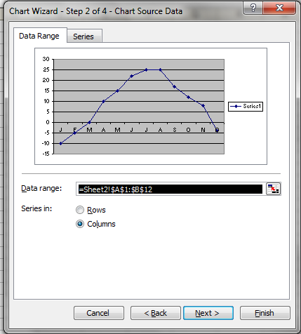
There are two tabs labelled Data Range and Series. The default setting is fine. Click next.
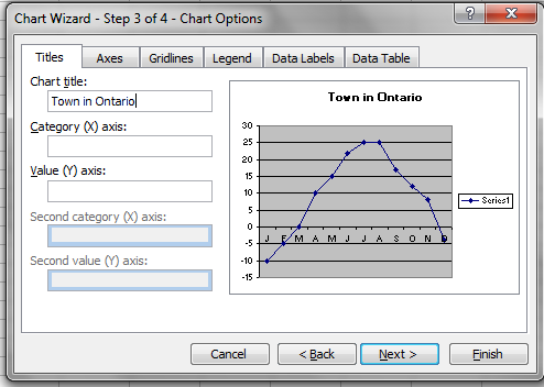
Select the Titles tab. Under the chart title enter Town in Ontario.
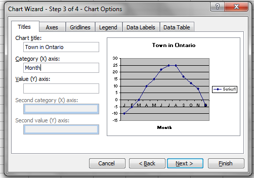
Under Category (x) title enter Month.
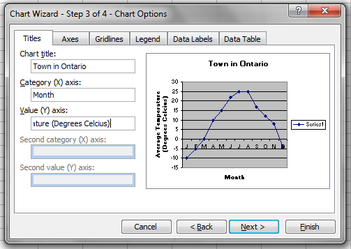
Under value (Y) axis enter Average Temperature (Degrees Celsius).
Select next and finish.
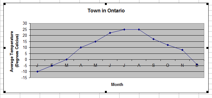
You can copy and paste the graph into a word document or print the graph.
Check your understanding
Here are some questions for you to try on paper. Complete the questions first and then compare your work with the suggestions provided. Review the solutions to ensure you are following the correct format. These questions will be similar to those on the assessment at the end of this unit.
1. The following graph represents the results on a survey done before a nationally televised reality talent show. The contestants were all winners from previous shows. Viewers were asked which of the contestants they would vote for.
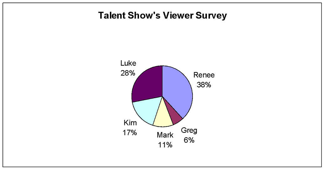
a) Who appears most likely to win the talent show?
Renee’s section of the graph is the largest. She is most likely to win the vote.
b) Who appears least likely to win the talent show?
Greg’s section of the graph is the smallest. He is least likely to win the vote.
c) What percentage of the people surveyed indicated they would vote for Luke?
Find Luke’s name. Below his name you’ll see “28%”. This means 28% of the people indicated they would vote for Luke.
d) There were 200 viewers surveyed. How many indicated that they would vote for Kim?
Seventeen percent of the people indicated they would vote for Kim. Since 200 people were surveyed, you need to find 17% of 200.
Therefore, 34 of the people surveyed said they would vote for Kim.
2. The following column graph shows the number of goals scored in one season by 10 players on a hockey team.
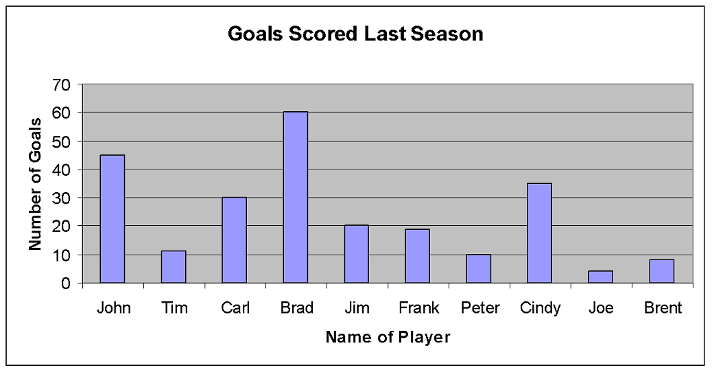
a) Who scored the most goals?
The bar above Brad’s name is the tallest. Brad scored the most goals.
b) Who scored the fewest goals?
The bar above Joe’s name is the shortest. Joe scored the fewest goals.
c) Estimate the number of goals John scored.
The bar above John’s name is halfway between 40 and 50 on the vertical axis. John scored about 45 goals.
d) How many more goals did Carl score than Jim?
The bar above Carl’s name goes to 30 in the vertical axis, so Carl scored 30 goals. The bar above Jim’s name goes to 20 on the vertical axis, so Jim scored 20 goals. To find how many more goals Carl scored than Jim, subtract the number of goals Jim scored from the number of goals Carl scored.
Carl scored 10 more goals than Jim.
3. The following graph contains information about Jason’s annual income for a period of eight years.
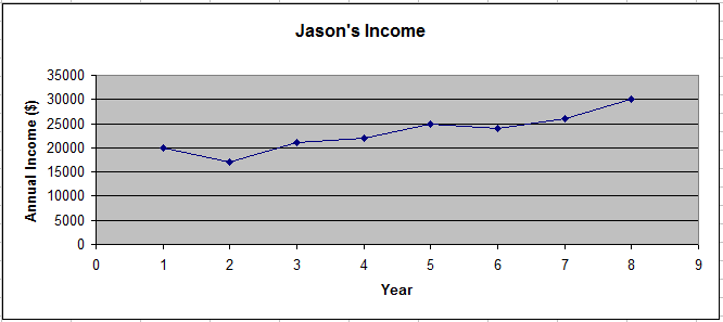
a) What was Jason’s annual income in year 5?
Find 5 on the horizontal axis. Trace directly up to the line, then across to the vertical axis and read the annual income. In year 5, Jason’s annual income was about $25,000.
b) In what years was Jason’s income lowest?
The lowest point on the graph is above year 2. Jason’s income was the lowest in year 2.
c) What is the overall trend (that is, is Jason’s income increasing or decreasing?) How can you tell?
Jason’s income is increasing. The general trend of the line is up from left to right.
d) From year 1 to year 2, Jason’s income went down. During what other time did his income go down?
The line goes down between year 5 and year 6. Jason’s income went down between years 5 and 6.
e) Estimate what Jason’s annual income was in year 4.
The point above year 4 is between 20000 and 25000. It is closer to 20000. Jason’s income in year 4 was about $22,000.
f) Estimate what Jason’s annual income will likely be in year 9. What assumption did you make?
Assuming the general trend continues, and Jason’s income goes up, his income will likely be between about $30,000 and $35,000. Jason’s income will likely be around $34,000.
4. Create the indicated type of graph for each of the following sets of data:
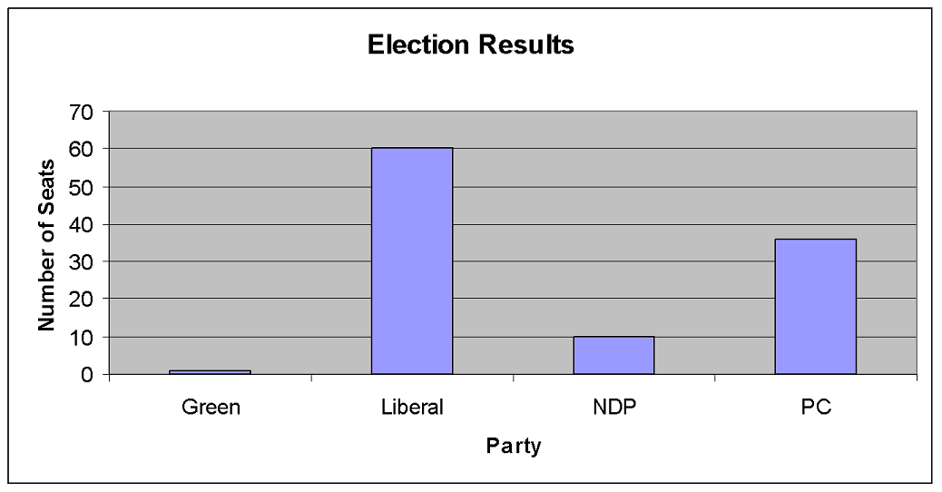
a) The results of the number of seats won in an election are provided in the following table. Display the data using a column graph.
| Election Results | |
|---|---|
| Party | Number of Seats |
| Green | 1 |
| Liberal | 60 |
| NDP | 10 |
| PC | 36 |
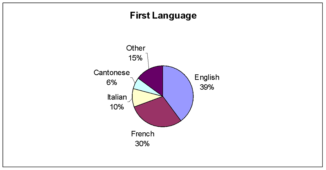
b) People in a small town were asked to identify their first language. The results of the survey are provided in the following table. Display the data using a circle graph.
| First Language | |
|---|---|
| Language | Frequency |
| English | 200 |
| French | 150 |
| Italian | 50 |
| Cantonese | 30 |
| Other | 75 |
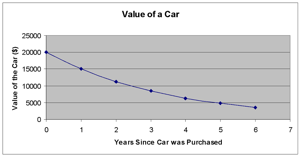
c) A gas station recorded the average cost of a litre of regular gasoline. Graph the data in the table using a line graph (XY Scatter).
| Average Cost of 1 Litre of Gasoline | |
|---|---|
| Year | Cost (in cents) |
| 1970 | 55 |
| 1975 | 53 |
| 1980 | 62 |
| 1985 | 85 |
| 1990 | 75 |
| 1995 | 68 |
| 2000 | 70 |
| 2005 | 92 |
| 2010 | 62 |
| 2015 | 109 |
Conclusion
Good work! You have completed Learning Activity 1. You have worked through all the examples and had several opportunities to check your understanding along the way. You should feel comfortable
- Reading and interpreting graphs obtained from various sources,
- Representing categorical data by constructing graphs using a spreadsheet, and
- Making inferences based on the graphical representation of data and justifying conclusions in writing using convincing arguments.
Now that you’ve learned to read graphs and to create graphs of existing data using technology, you may be wondering how the data is collected. In Learning Activity 2, you’ll learn about different methods of data collection and you’ll be able to use your skills to graph the data that you’ll collect.


