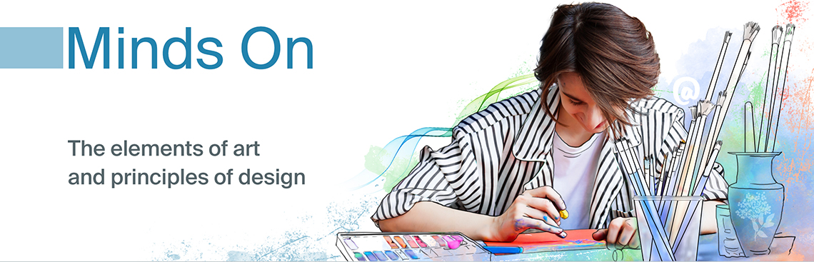
Learning goals
You are learning to:
- identify a variety of art elements and design principles in a visual arts context that supports your learning for the duration of this course
- make connections between definitions of art elements and their visual representations
- familiarize yourself with the material components of visual arts
Success criteria
I am able to:
- set personal goals to familiarize myself with required concepts and their visual representations
- articulate my hopes and expectations for learning and achievement in this course
- formulate a plan to meet the course expectations with regards to daily work, material supplies familiarity, and my own sketchbook practice
Introduction
Welcome to AVI1O: Visual Arts, Grade 9, Open.
This course provides an overview of the visual arts and is a foundation for further study.
Art comes in several forms, and is continually changing and evolving with the society around it. You will develop some fundamental art skills and experiment with techniques in various forms which will include:
- drawing
- painting
- printmaking
- graphic design
- collage
- mosaic
- mixed media
- three-dimensional art
You’ll also learn how to use symbolism and learn how to choose materials that add meaning to your work.
By the end of the course, you will have made several artworks, becoming familiar with a range of forms, materials, media, processes, techniques, and styles.
This course is divided into four units and has five learning activities within each. Each unit has different types of assessments that will be evaluated as part of your Portfolio at the end of the course. For each unit, you will learn about specific expectations, using materials and art supplies in safe and effective techniques, and the importance of academic honesty.
Throughout your visual arts course, you will also find examples of student answers and student art pieces. Let’s meet some student artists who you will encounter throughout your course!

Three student artists introduce themselves. Rose: Hi! I'm Rose (she/her), and these are my friends Elliot and Anga! We are also taking Visual Arts. I am an artist who loves to paint.
Now that you have met the visual art students, let’s explore some of the course icons.
Icons
Throughout the course, you will come across a variety of icons. Icons are included to draw your attention to a task, activity, or reminder. Let’s explore several icons that you will be using throughout your course!
The following three icons are related to your sketchbook, your notebook, and the glossary of art definitions you will be creating throughout the course.
The first icon you will check out is the following Sketchbook icon.
Sketchbook
In visual arts, artists use a sketchbook to make notes, brainstorm design ideas, and experiment with different techniques, materials, and styles.
You will be using a sketchbook throughout this visual arts course to record your visual ideas and your art pieces. Your sketchbook is an invaluable resource as you create your evaluated portfolio pieces.
An ideal sketchbook is 20 cm by 25 cm, and has blank paper that can be used for mixed media, such as drawing and painting with acrylic. Materials you need to complete your sketchbook activity will also be listed. It is strongly recommended that you use the suggested art supplies to complete your artwork. If you are unable to use the suggested materials, consider using alternative art supplies or explore a digital art option.
The next icon you will often come across is the Notebook icon.
Notebook
When you encounter a Notebook icon like this one, you will be invited to answer questions from the learning activity. A notebook can be a paper or digital document—or maybe both! You’ll use your notebook to:
- record notes and key ideas from the learning activities
- respond to questions and prompts to support your learning
- analyze art using methods of art criticism
- develop responses to reflect on course topics
Notebook questions and prompts will not be assessed. Often, sample answers will be provided to help you self-assess your learning.
Your notebook will also be used for brainstorming, researching, and notes that you will refer to when you are completing your written portions of your portfolio and assessed art assignments. You may decide to use the same book as your sketchbook. When you are adding to your notebook, it is a best practice to note down the date, the unit, and the learning activity to keep track of your answers.
You will also be using your notebook to record a glossary of art definitions for each unit!
Take some time to set up your notebook now.
Another common icon is the Definition icon, which indicates important art definitions that should be included in your personal glossary of art definitions. Let’s check it out!
Definition
Adding to your notebook glossary
As you work through your course, you will be creating a glossary of art definitions. A glossary is a list of words and their definitions. In your notebook, create a section to record a glossary for each of your units. Each time you find a new definition, add the word and its definition to your notebook.
Before you start your next unit, create a glossary in your notebook. Label your glossary with the title ‘Unit 1 Glossary of Art Definitions.’ It is also recommended that you label which learning activity you find a definition in so you can refer back to the learning activity if you want to review more information. You can decide if your glossary is written sentences or bullet point notes.
For example, you may write entire sentences.
Unit 1 Glossary of Art Definitions
Line (LA #1): A line is the path left by a moving point, such as a pencil or a digital drawing tool.
Or you may prefer to take bullet point notes.
Unit 1 LA 1.1: Line: path left by pencil or tool
The previous icons are some of the common icons you will find in each learning activity. Another part of each learning activity will be the materials and art supplies you will need.
Art supplies

For this course, you will be responsible for acquiring the necessary art supplies. In the first learning activity of each unit, you will be given a list of supplies needed to complete the various tasks and assignments in that unit.
You’ll be doing artwork in every learning activity, and you will need a sketchbook right from the start. The following list is an overview of the required art supplies you will need for the learning activities in this unit. It is okay if you don’t have all of the items. The great thing about visual arts is that there are many different ways to learn! Each learning activity includes a checklist of materials needed such as the following example:
Materials needed for drawing
For your Portfolio pieces, it is strongly recommended you use the suggested art supplies to create your art piece. However, if you are unable to complete your art piece with the recommended art supplies, explore an alternative creation method such as other art supplies or a digital creation method.

When you are making digital artwork, there are a variety of fun and innovative digital tools to create art. Some free digital tools include:
- Windows Paint
- the Adobe family of Tools
- Google Play Store Apps
- Sketchpad via Google Chrome
- Procreate
- many other free online apps
Please note: Some aspects of this course rely on sensory information to adequately meet curriculum expectations.
Part 1: The elements of art
The first thing you’ll do in this course is learn about the basic building blocks of art. These are known as the elements of art and the principles of design. Once you know what these are and how they work together, you’ll be able to analyze the work of other artists and use the elements and principles while making your own artwork.
Definition
The elements of art are the basic attributes, ideas, and parts of artwork that are used to create an artwork.
The principles of design are ways to organize or arrange the elements of art in a work of art. The principles of design are also used to analyze an art piece.
These elements and principles are what artists use to create artworks. The following section of the learning activity will introduce you to the following elements of art:
- line
- shape
- form
- space
- texture
- value
- colour
Next, you will explore more information about each of the elements. Before getting started, the following are two important art definitions that you will encounter throughout the course. Set up your Unit 1 Glossary to record the definition of these terms. You can consider adding your own ideas and even sketches to your glossary to help your understanding.
Definition
Objective art describes any form of art that draws from the real world and particularly the human figure. The shapes and designs can be more easily recognizable and represent real shapes and designs from the real world. Another term for objective art is figurative art.
Non-objective art is art that does not attempt to represent an accurate depiction of a visual reality. The artist freely uses the elements to make a composition that can be left up to interpretation. Another term for non-objective art is abstract art.
Let’s check out the elements of design. These elements will be useful throughout your entire course, and during your journey as an artist. As you explore the elements of design, use your notebook to add each definition to your glossary of art definitions. To help your understanding, you can add your own ideas, questions, and sketches to each definition.
Line
The first element of design is line.
Definition
A line is the path left by a moving point, such as a pencil or a digital drawing tool. A line may be a continuous mark made on a surface with a pointed tool or implied by the edges of shapes and forms. Line can be used to define shape and outlines, and also to suggest volume and depth.
A line is used as a mark, a guide, or a boundary that leads the audience’s attention in an artwork. Diversity in the type, orientation, and/or quality of lines can be used to suggest a variety of ideas, shapes, or emotions.
Lines come in many shapes and sizes, and have a variety of characteristics. A single art piece can have many different types of lines. Check out the following images to find out some characteristics of lines.


Now that you’ve learned all about line, it’s your turn to practice making a variety of lines in your sketchbook!
In visual arts, artists use a sketchbook to make notes, brainstorm design ideas, and experiment with different techniques, materials, and styles.
You will be using a sketchbook throughout this visual arts course. You are going to start your first sketchbook entry by creating a set of examples that illustrate the elements of art and the principles of design you are learning in this learning activity.
Materials needed for drawing
For this sketchbook practice, it is strongly recommended you use the suggested art supplies to create your art piece. However, if you are unable to complete your art piece with the recommended art supplies, explore an alternative creation method such as other art supplies or a digital creation method.
For each element of art, you will be creating a sample drawing that demonstrates each of the elements. Each element includes step by step instructions, like the following example:
Creating elements of art sketchbook samples
- Start by drawing a 5 cm by 5 cm square box using a hard pencil (like an HB drawing pencil) and a ruler. You will draw your sample of the element inside this box.
- Fill the sample box with the element of art.
- Underneath the box, label which element of art it is.
Keep your sketchbook nearby as you move through this learning activity, as you will be creating multiple samples.
Sketchbook
Let’s get started with a line sample!
For your first sample, you are going to create a sample box with a variety of lines. Remember to label the box. You can also consider including extra notes such as the unit and learning activity number, and keywords that relate to your art sample.
Creating your line sample
- Start by drawing a 5 cm by 5 cm square box using a hard pencil (like an HB drawing pencil) and a ruler.
- Fill the sample box with at least three kinds of lines.
- Underneath the box, label which element of art it is, and what kind of lines you included.
- Label your sketch with the unit and learning activity number.

Shape
The next element of art is shape.
Definition
When a line crosses itself or intersects with other lines to enclose a space, it creates a shape. A shape is two-dimensional. It has height and width, but no depth. A shape’s boundary can be created by line, value, colour,and/or texture. Shape may be geometric or organic and may be positive or negative.
Explore this!
Check out the following video entitled Elements of Art - Shape by Make a Mark Studios to learn more about how artists create different types of shapes.
There are two main categories of shape.
Definition
Geometric shapes include circles, squares, rectangles, and triangles. You can find them in mathematical applications, architecture, and manufactured items with straight edges.
Organic shapes include leaves, seashells, and flowers. You can find them in nature; they are free-flowing, informal, and irregular.

Two images side by side, the first featuring geometric shapes like circles and rectangles and the second featuring organic shapes like shells and leaves.
Let’s use your sketchbook to create some shape examples!
Sketchbook
Organic shapes and geometric shapes
For your shape samples, draw two 5 cm by 5 cm boxes. Fill your first box with organic shapes. Fill your second box with geometric shapes. Remember to label each box!

Creating your shapes samples
- Start by drawing two 5 cm by 5 cm square boxes using a hard pencil (like an HB drawing pencil) and a ruler.
- Fill your first box with organic shapes.
- Fill your second box with geometric shapes.
- Underneath your boxes, label the elements of art you’ve included.
- Label your sketch with the unit and the learning activity number.
Form
Definition
Form is the three-dimensional shape and dimensions of an artwork, or of objects within an artwork. Form has height, width, and depth. Form can also mean the illusion of a two-dimensional object being three-dimensional, and appearing to have length, width, and height by using shading and/or perspective. Forms can be geometric or organic.
Shapes are two-dimensional (height and width), whereas forms are three-dimensional (height, width, and depth). You can hold a form or move around a form. In drawing or painting, an artist can create the illusion of form with shadows. Shading a circle in a certain manner can make it appear to be a sphere.
Explore the following interactive entitled Shape Versus Form to check out the relationship between a circle shape and a sphere form.
The illusion of form can also be created with the use of line to show the perspective or depth of objecst. For example, in the previous illustration you just examined, lines and shading, were used to show perspective and to create the illusion of depth. Examine the following flashcards to find the relationships between some two-dimensional shapes and their three-dimensional forms.
Press the flip button to reveal the form on the other side of the card. Use the arrow keys to navigate between cards.
Like with shapes, forms can be geometric or organic.

Now get out your sketchbook to create your form sample!
Sketchbook
Choose a shape to make into a form!
For your form sample, you are going to create a sample box with a form. Remember to label the box. You can also consider including extra notes such as the unit and learning activty number, and keywords that relate to your art sample.
Creating your form sample
- Start by drawing a 5 cm by 5 cm square box using a hard pencil (like an HB drawing pencil) and a ruler.
- Fill the sample box with a shape of your choice.
- Use your pencil to turn your shape into a form. You can consider adding extra lines to show it has height, width and depth. You could also consider using a softer pencil, such as a 2B drawing pencil, to add shading to your chosen form. Check out the previous examples for inspiration!
- Underneath the box, label which element of art it is, and whether you chose an organic form or a geometric form.
- Label your sketch with the unit and learning activity number.

Space
The next element of art is space.
Definition
Space can be the area around, inside, or between parts of an artwork. Space can be a physical distance between objects. It also refers to the area in which the artwork exists.
Space can also be an illusion of distance in a two-dimensional piece. The illusion of space can be created by a variety of techniques, including overlapping parts, a variety of sizes, changing value or colour, the use of detail, and perspective.
Creating the illusion of space
For drawings and paintings, the goal is to create the illusion of space. Some techniques that artists use to create the illusion of space are:
- overlap
- variety
- warm colours and cool colours
- detail and focus
Check out the following carousel of images to learn more about how these techniques create space.


Image four:
An image of flamingoes. The one close up flamingo is more detailed and the texture of feathers can be seen. There are other small flamingoes with significantly less detail in the background.
By understanding how to combine techniques to imply space in a
work of art you can create a composition that creates the illusion
of more space and depth.
Definition
A composition is how an artwork is arranged. The organization and arrangement of the elements of design in an artwork is carefully created by an artist to create a desired layout.
Explore this!
Access the following video entitled Six Ways to Create the Illusion of Space by Miriam Paternoster to learn more about how artists can create the illusion of space in two dimensional artworks.
Positive space and negative space
Space also refers to the positive and negative space in an artwork.
Definition
Positive space is space occupied by the basic form or shape of a composition.
Negative space is the empty space between an object or shape in an artwork. Negative space can become a negative shape when an artwork has boundaries.
Check out the following image of positive space and negative space. You may want to add a sketch to your glossary of definitions to help you remember the difference between positive space and negative space.

Sketchbook
Positive space and negative space samples
- Draw two 5 cm by 5 cm boxes using a hard pencil and a ruler.
- Decide on an organic shape to fill most of your first box.
- Draw your organic shape in your second box, filling most of the box with the shape.
- For your first sample, your organic shape is going to be the positive space. Carefully shade or colour the negative space around your chosen shape. You can use a softer art pencil such a B pencil or a 2B pencil. Or you can use your coloured pencils.
- Now, decide on a geometric shape to fill most of your second box.
- Draw your geometric shape in your second box, filling most of the box with the shape.
- For your second sample, your geometric shape is going to be the negative space. Carefully shade or colour the negative space inside your geometric shape. You can use a softer art pencil such as a B pencil or 2B pencil. Or you can use your coloured pencils.
- Remember to label the boxes with the element of art and label which parts are the positive spaces and the negative spaces!

As you create your samples for the elements of art, you are creating a perfect quick reference guide for the rest of your visual arts course! These foundational concepts are used throughout all types of art and design.
Texture
Another element of art is texture.
Definition
Texture is the surface quality of an object, including the feel, appearance, thickness, or stickiness of a surface or substance. It is the element of art that appeals to your sense of touch. A rock may be rough and jagged. A piece of silk may be soft and smooth. When you observe an object, the surface patterns of light and shadow are what communicate to you how these objects might feel. Texture can be the illusion of texture or real texture.
There are two main categories of texture: real texture and implied texture.
Definition
Real texture is the actual texture of an object. Real texture is created by three-dimensional materials and surfaces that can be perceived by senses such a touch and sight.
Implied texture is an optical illusion created on a two-dimensional surface (paper or canvas) by reproducing the desired texture pattern. Implied texture can be created with techniques including shading, colour, line, and shape to create a perception of three dimensional texture on a two-dimensional surface. It is also referred to as simulated texture or illusory texture.

An example of a stone which has real texture, and a drawing of a stone that has implied texture. They are labelled 'Real texture' and 'Implied texture.'
Sketchbook
Practicing with texture
- Start by drawing two 5 cm by 5 cm boxes with your pencil and ruler.
- Check out your surrounding environment for some inspirations for your textures.
- Fill your first 5 cm by 5 cm box with a drawing of a smooth texture.
- Fill your second 5 cm by 5 cm box with a drawing of a rough texture.
- Remember to label the boxes!

Value
The next element of art is value.
Definition
Value is the lightness or darkness in an artwork. Value is created by the gradual changes in the lightness or darkness of an artwork, even when colour is absent.
Value is used to create the illusion of texture and light in art. Value also helps create depth within a picture by making an object seem three-dimensional, with highlights and shadows.
Definition
Highlights are very light values that show where the light hitting the object is strongest.
Shadows are dark values showing where no light is reaching the object.
There are many approaches to creating changing values in your art pieces.
- Changes in value can be created by adding white or black to a colour, such as adding a small amount of white paint to a blob of blue paint and mixing them together.
- A value can be changed by erasing or adding more art medium to an art piece, such as adding an additional layer of pencil shading on top of an area to make it darker.

Exploring a value scale
For your next sketchbook sample, you are going to create your own value scale.
Definition
A value scale is a scale that shows the gradual change in value from the lightest value, white, to the darkest value, black.
Before you begin your scale, check out the following video.
Explore this!
Examine the following video entitled Understanding Value (Light and Dark) and Drawing Value Scales by Mr. New’s Art Class to learn more about value scales and how to make your own!
Now you can use your sketchbook, ruler, art pencils and coloured pencils to create your own scale.
Notebook
Creating your own value scale
- Start by drawing a 5 cm high by 20 cm wide rectangular box using a hard pencil (like an HB drawing pencil) and a ruler.
- Divide your rectangle into four roughly equal parts of 5 cm by 5 cm.
- Use a coloured pencil or a soft art pencil such as a 2B pencil to carefully shade each box. The box starting on the leftmost side will be the lightest shade. Each progressive box will be slightly darker.
- Begin your lightest shade by pressing your art pencil very lightly. Gradually press more heavily on your pencil as you shade your value scale from light to dark.
- Label each of your values ‘light’, ‘medium’, ‘medium-dark’, and ‘dark’.
- Label which element of art it is.
- Label your sketch with the unit and learning activity number.

A box filled with different shades representing a value scale. The box is labelled "Element of art: Value, light', 'medium', 'medium-dark', and 'dark'. Unit 1 LA 1.1."
Colour
The final element of art is colour.
Definition
In scientific terms, colour is the particular wavelength of light viewed by the eye when an object reflects or emits light. The four characteristics of colour are hue, value, intensity, and temperature. Colour categories include primary, secondary and tertiary. Colours can also be sorted into the temperatures of warm or cool colours.

A colour wheel that shows the relationships between different colours. The primary colours of yellow, red, and blue are labelled. The secondary colours of orange, purple, and green are also labelled. One half of the colour wheel includes the cool colours, including greens, blues, and some purples. The other half of the colour wheel is labelled as warm colours, which include yellows, oranges, reds, and some purples.
Let’s explore the different parts of the colour wheel.
Press the following tabs to learn more about the different parts of the colour wheel.


A colour wheel titled Intermediate Colours. The colours labeled are red-orange, yellow-orange, yellow-green, blue-green, blue-violet and red-violet.

A colour wheel with the title Warm Colours and Cool Colours. Warm colours are yellow, yellow orange, orange, red-orange, and red. Cool colours are red-violet, purple, blue-violet, blue, blue-green, and green.
Colour is a very expressive and varied element of art! Artists use pigments in the form of powder or liquid paints to create colour. Later in the course, you will learn how to mix colours and control their properties. You will explore how artists use colour to communicate a mood or express emotions. You will be learning more about this very important element in the learning activities to come, and particularly in Learning Activity 2.1.
Sketchbook
Practice with colour
- Start by drawing three 5 cm high by 5 cm wide rectangular boxes using a hard pencil (like an HB drawing pencil) and a ruler.
- Use your coloured pencils to fill each box with colour. You can consider using one coloured pencil to lightly colour one box, and a second coloured pencil to colour directly on top of the same box. How does the original colour you used change?
- Label each box with the name of the colour your created. If you created a new colour, you can also choose a new name that you feel describes your colour!
- Label your colour sample boxes with the unit and learning activity.

Three boxes filled with three different colours. The boxes are labelled ” Element of art: Colour: , ‘blue’ , ‘swamp yellow’, ‘purple’. Unit 1 LA 1.1.”
You now have a robust glossary of art definitions and accompanying samples of each element of art, as well as the art supplies to coninue your exploration of art throughout this unit.
Take a break!
Excellent work! You have just completed the section on the elements of art. Now is a great time to take a break before you move on to the next section on the principles of design.
Part 2: The principles of design
What are the principles of design?
Definition
The principles of design are ways to organize or arrange the elements in a work of art.
The arrangement of elements affects how the audience engages with the artwork. The next section of the learning activity will introduce you to the following principles of design:
- balance
- rhythm and movement
- emphasis
- unity
- variety
Let’s check out each principle of design! Have your notebook nearby for adding definitions to your glossary. You will also need the following art materials:
Materials needed
For this sketchbook piece, it is strongly recommended you use the suggested art supplies to create your art piece. However, if you are unable to complete your art piece with the recommended art supplies, explore an alternative creation method such as other art supplies or a digital creation method.
Balance
The first principle of design is balance. You probably have used the word balance in different ways, so let’s explore the definition of balance when you are thinking about art and design!
Definition
Balance is when the elements in an art piece are arranged to create visual equality and the impression of stability. Balance is created by having equal visual parts on each side of the art. Balance can be created by using weight, importance, harmony of design, and proportion.

When exploring a balanced artwork, the audience feels that the elements have been arranged harmoniously. When the audience senses that something is missing or out of place in the work, it is likely not balanced. There are several different types of balance.
Types of balance
Let’s explore the three types of balance.
Symmetrical balance
Definition
Symmetrical means that the shapes or forms have two halves that are exactly the same, or mirror each other very closely.
Symmetrical balance occurs when the two sides of a composition are mirror images of each other. However, this type of balance can be very predictable and static. Symmetrical balance is usually used by artists to express stability and to establish a visual order.
Press the Symmetrical Balance button to explore an example.

Asymmetrical balance
Definition
Asymmetrical balance means the two sides of an artwork are not visually equal and appear different, but still balance each other out.
Asymmetrical balance arranges the elements less predictably than symmetrical balance. Artists estimate the visual weight of the artwork’s different areas and arrange the elements so that they balance each other out.
Press the Asymmetrical Balance button to explore an example.

Radial balance
Definition
Radial means a composition that arranges the elements of design in a circular pattern that emanates from a central point.
In radial balance, compositional elements appear to revolve around a central point, or radiate out from the centre of a circle. Radial balance frequently occurs in nature—think of a flower or a cross-section of an orange. Like symmetrical balance, radial balance comforts the viewer and creates a sense of completion or wholeness.
Press the Radial Balance button to explore an example.

Now that you’ve learned about balance, it’s your turn to create sketchbook samples of the diverse types of balance!
Sketchbook
Finding your balance!
You are going to create three samples of balance.
- Start by drawing three 5 cm by 5 cm boxes using your hard pencil and your ruler.
- Fill your first 5 cm by 5 cm box with a shape that shows symmetrical balance.
- Fill your second 5 cm by 5 cm box with a form that shows an asymmetrical balance.
- Finally, fill your third 5 cm by 5 cm box with lines that show radial balance.
- Remember to label the boxes with the type of balance, the principle of design and the unit and learning activity.

Emphasis
The next principle of design is emphasis.
Definition
Emphasis means that special attention or importance is given to one part or element in an artwork. Emphasis is used to direct the audience’s attention to the emphasized element first.
When one element is emphasized, it dominates or stands out from the rest of the composition. In most compositions, the emphasis is also known as the focal point.
Definition
The focal point is often the core or the centre of the picture, a place that attracts the audience’s attention, or an element that stands out in the composition.
Emphasis can be achieved by using the elements of art to direct the audience’s focus, and/or in contrasting colour, shape, and with size.

How does the previous art piece create a sense of emphasis? Consider what elements of art and principles of design you have learned about that can be used to create emphasis.
Press Rose’s Answer button to consider her answer.

Rose is thinking about how the art piece creates a sense of emphasis. The art piece uses scale to emphasize how giant the baby chick is in comparison to the person next to it. The art piece also uses the bright yellow colour to emphasize the baby chick!
Now you’re ready to create some samples of emphasis in your sketchbook!
Sketchbook
Practice with emphasis
- In your sketchbook, draw two boxes of about 5 cm by 5 cm, using a hard pencil and a ruler.
- In your first box, use your art pencils or coloured pencils to create value or use colour to create emphasis.
- In your second box, use shape or line to create emphasis.
-
Label your boxes with the principle of design, the unit
number, and the learning activity number.
Press Rose’s Emphasis Samples button to check out her examples.
Rose used colours and lines to create her two samples of emphasis.

One box with a wildly coloured organic shape, against a white background. A second box has one thick line with several skinny lines behind it.
Rhythm and movement
The next two principles of design are rhythm and movement.
Definition
Rhythm uses repeated elements to create movement in an artwork. Repeating elements direct how the audience perceives the art work. Rhythm guides the audience through the artwork in a set pathway. Rhythm gives a sense of unity to artwork.
Movement is the impression of action along a path in an art piece. Elements of design are organized so that the audience considers the artwork in a systematic way or along a set pathway. Movement can be created by using lines, edges, shapes, colours, and values. Movement often ends at the focal point or the most important part of an artwork.
To create the illusion and feel of movement in visual art you can repeat elements at regular or random intervals.
Repeated elements create visual rhythm, just as repeated musical notes create a beat.
Visual rhythm, experienced through your eyes as opposed to your ears, creates a mood for the artwork according to how fast or slow the repetition occurs and how the audience’s attention moves through the work.
Let’s check out some examples of rhythm!


Now that you’ve checked out four different types of rhythm, get out your sketchbook to create some rhythm samples!
Sketchbook
Practice with rhythm
- In your sketchbook, draw four boxes of about 5 cm by 5 cm, using a pencil and a ruler.
- In the first box, draw an example of regular rhythm. Label your box with the rhythm type.
- In the second box, draw an example of random rhythm. Label your box with the rhythm type.
- In the third box, draw an example of alternating rhythm. Label your box with the rhythm type.
- In the fourth box, draw an example of progressive rhythm. Label your box with the rhythm type.
- Remember to label your boxes with the principle of design, the unit, and the learning activity.
Great work on your principles of design samples so far!
Unity
The next principle of design is unity.
Definition
Unity is the principle that makes the parts work together to create a compelling “whole.” Unity is created by the arranging of elements to create a sense of wholeness.
Unity can be made by repeating elements and by using similarity, placement, and continuity. Every part works together to make the whole better. In a unified composition, the elements all seem like they belong together.
Unity in artwork
To create unity, artists may use similar lines, shapes, colours, or textures to tie together the elements of the work.
Unity in art is like harmony in music or teamwork in sports. The finished piece has a sense of wholeness or completion. Unity creates a feeling of satisfaction in the audience.

Let’s check out some techniques to create unity.


Get out your sketchbook to explore your unity sample!
Sketchbook
Practice with unity
- In your sketchbook, draw one box of about 10 cm by 10 cm, using a hard pencil and a ruler.
- Decide which technique of unity you will use in your sample.
- Create your sample of unity that shows your chosen technique.
- Label the sample with the principle of design, your chosen technique, the unit, and the learning activity.

A box is filled with many lines of the same width and colour. The box is labelled: "Principle of design: Unity, Technique: Similarity, Unit 1 LA 1.1."
Variety
The final principle of design is variety.
Definition
Variety is the creation of different areas of interest in an artwork. Variety is created by using diverse elements in art for contrast. Variety can be created by using diverse shapes, sizes, colours, and textures.
The principle of variety has to do with differences in the elements. Whereas unity encourages similarities, variety encourages differences. Artists use variety to create visual interest in the work.
An artist could use a variety of different elements, or one element in varied ways. For example, a work may contain only line, but that line may vary by being thick, thin, short, long, wavy, and straight.
To create variety, artists use elements that are different or contrasting. These various elements can include:
- contrasting values
- contrasting colours
- different shapes
- changing textures
- different patterns
- changing proportions
- multiple quantities
- different levels of detail

Get out your sketchbook for your final principle of design sample!
Sketchbook
Practice with variety
- In your sketchbook, draw two boxes of about 5 cm by 5 cm, using a hard pencil and a ruler.
- In your first box, choose an element of design to create your sample. Label which element you used. You can check out the previous list of design elements for inspiration!
- In your second box, choose a different element of design to create your sample. Label which element you used.
- Finish your sample by labelling the design principle, the unit, and the learning activity.
Press Rose’s Variety Samples button to check out her samples.
Rose chose to use a variety of lines in different widths, and a variety of shapes to create her samples.

Two boxes with a variety of lines in different widths, and a variety of shapes, labelled Variety: Lines, Variety: Shapes, Principle of design: Variety, Unit 1, LA 1.1.
Congratulations on finishing your principles of design samples!

Rose and Anga discussing what they've learned so far. Anga: Wow, I've learned so much about the elements of art and the principles of design. How will I keep it all organized?
Getting ready to make art!
Rose is thinking about how the art piece creates a sense of emphasis. The art piece uses scale to emphasize how giant the baby chick is in comparison to the person next to it. The art piece also uses the bright yellow colour to emphasize the baby chick!
Another important icon that you will come across throughout your visual arts course is the Portfolio icon. The Portfolio icon indicates an art creation and/or response to prompts that will be part of your evaluated Culminating Project.
Portfolio
This icon refers to a creative art activity and/or a recorded response to prompts that you will save and submit as part of your Culminating Project for this course. When you complete the activity, take a photograph of your creative work, record your responses, and upload it to a file on your computer. In Learning Activity 1.2 you will learn more about what is expected for each Portfolio item.
You can collect portfolio answers on paper or digitally by creating a folder on your desktop and then saving your portfolio documents there until you submit them. Take some time to set up your digital folder for your portfolio documents.
Conclusion
Review
In this learning activity, you have:
- had an introduction to the elements of art and to the principles of design
- defined different styles and techniques in your notebook
- created samples of concepts in your sketchbook earned new vocabulary for discussing the visual arts
Notebook
Answer the following three reflection questions in your notebook:
- What did you find was the most challenging element or principle to practice creating?
- What was the activity that you enjoyed the most? Why?
- Has this first learning activity changed what you think drawing is all about?
Your next learning activity is going to explore the elements of balance and pattern more thoroughly. You will use the steps of the creative process to design a personal symbol based on your initials.
Connecting to transferable skills
Ontario worked with other provinces in Canada to outline a set of competencies that are requirements to thrive. Ontario then developed its transferable skills framework as a set of skills for students to develop over time. These competencies are ones that are important to have in order to be successful in today’s world.
Read the following document entitled Transferable Skills Outline (Opens in a new window) to explore the framework and the descriptors for each skill. Download, print, or copy the information in the document into your notes - you'll refer to it in each unit.
Note the indicators that you think you will develop in this course. Throughout this course, you should revisit these skills to reflect on which ones you develop and if your original predictions were correct.
As you continue through this unit and the rest of the course, keep your notebook updated and be mindful of opportunities to apply and develop transferable skills.
Self-check quiz
Check your understanding!
Complete the following self-check quiz to determine where you are in your learning and what areas you need to focus on.
This quiz is for feedback only, not part of your grade. You have unlimited attempts on this quiz. Take your time, do your best work, and reflect on any feedback provided.